Progression

Ui/UX Design

Home

The original homepage design used large photos for each workout category. While it looked nice, it was crowded and didn’t guide the user clearly. In the new version, I focused on clarity and ease of use. It shows progress at the top, offers suggested workouts, and has a clear Start button. This makes it much easier for users to see their progress and begin a workout right away.

— Click to Flip —

OLD

— Click to Flip —

OLD

— Click to Flip —

OLD

Workout

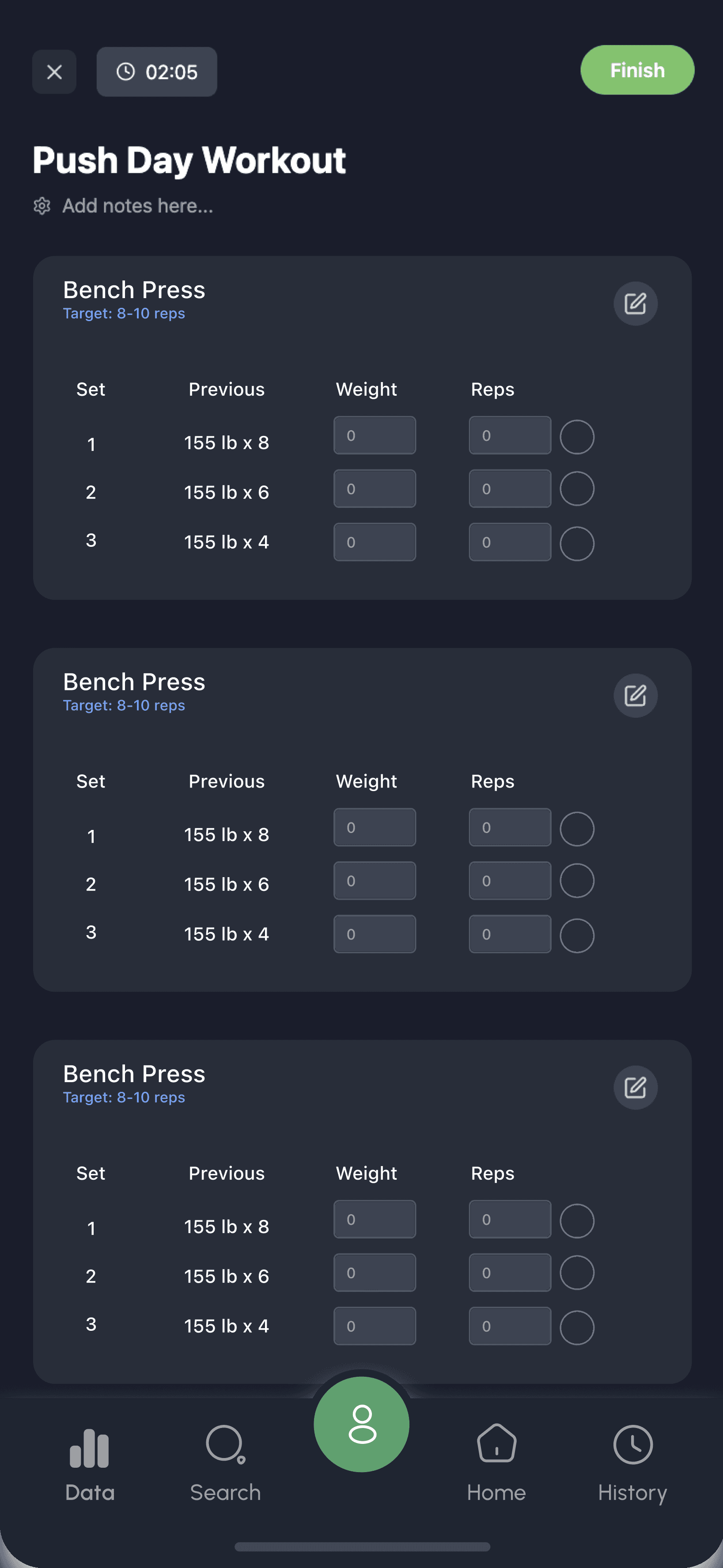
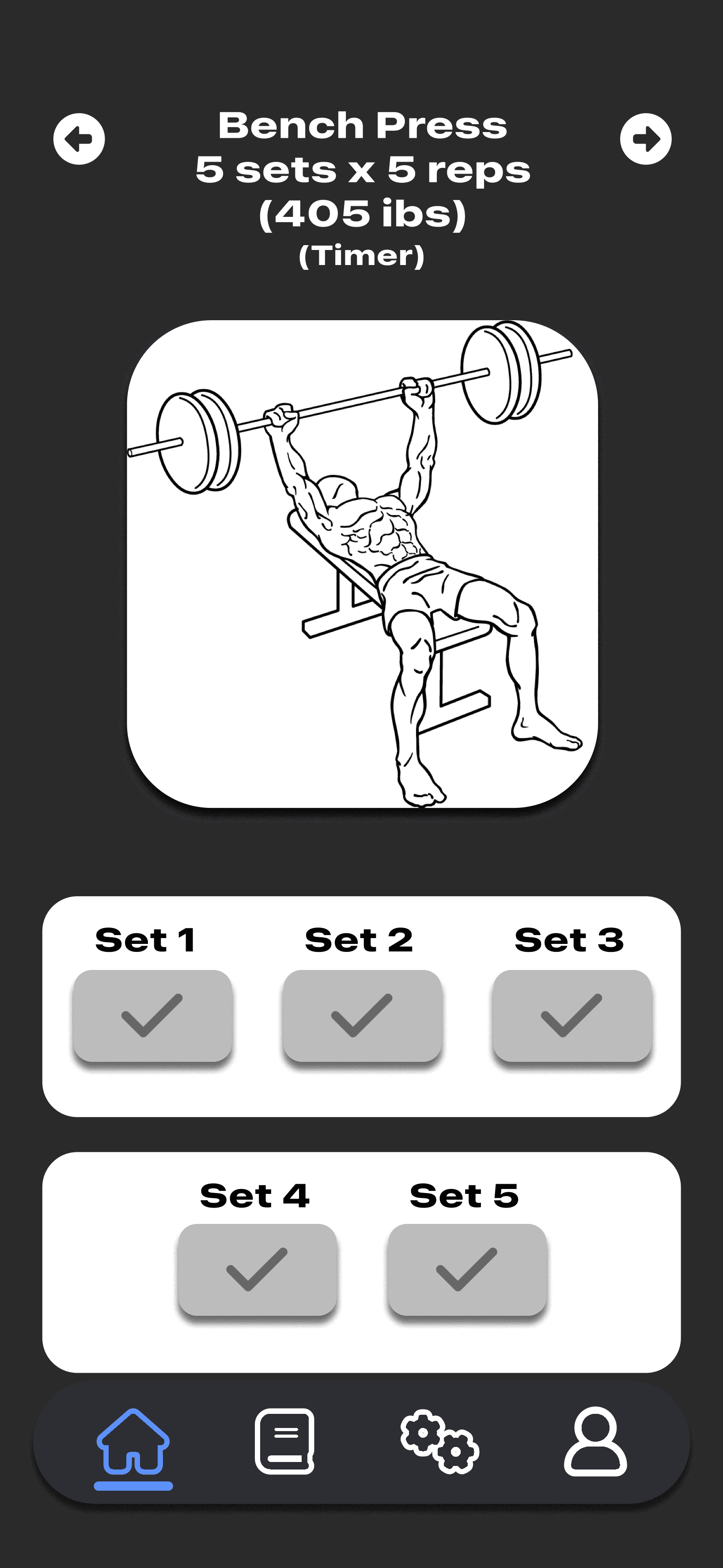
My old workout page was simple but limited, showing one exercise at a time with big images and basic checkmarks. The new design is more detailed and user-friendly, letting users see their entire workout at once, track previous weights and reps, and easily log new numbers as they go. It makes the whole experience clearer, faster, and more helpful for staying on track.

— Click to Flip —

OLD

— Click to Flip —

OLD

— Click to Flip —

OLD

Profile

My first rendition of the profile page had simple navigation but felt plain and lacked strong visual cues. In the new version, I focused on making it clearer and more engaging. I added icons for quick recognition, improved the layout for easier scanning, and included new options like editing measurements and changing workouts. Overall, it’s more organized, intuitive, and user-friendly.

— Click to Flip —

OLD

— Click to Flip —

OLD

— Click to Flip —

OLD

Copyright © 2025 Ford Lenchner. All rights reserved